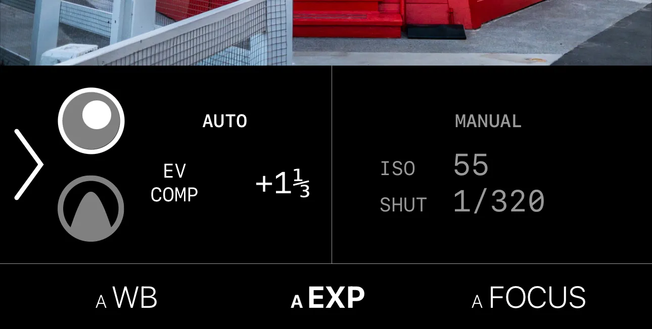
While building my camera app, I had several UI elements with text labels whose width could change, the most prominent being the current exposure values (e.g. current ISO, shutter speed):
Although it currently uses percentage-based layouts, I initially relied on SwiftUI’s default behaviors to allocate the proper amount of space to each sub-view (e.g. auto/manual, label/value pairs). However, I ran into an annoying problem: as the ISO or shutter speed changed, the width of the text values could change, causing a re-layout of the entire exposure view.
As I did not want to hard-code widths - something that would need to consider
Dynamic Type, screen width and available height, my initial solution was a
ZStack with a hidden text view containing the widest text that would be displayed:
ZStack(alignment: .topLeading) {
  // Widest text that will be displayed
  Text("1/1000s")
    .hidden()

  // The actual shutter speed
  Text("1/5s")
}
.monospaced()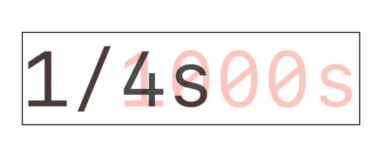
ZStack containing ‘hidden’ (transparent red) text and the actual displayed text.
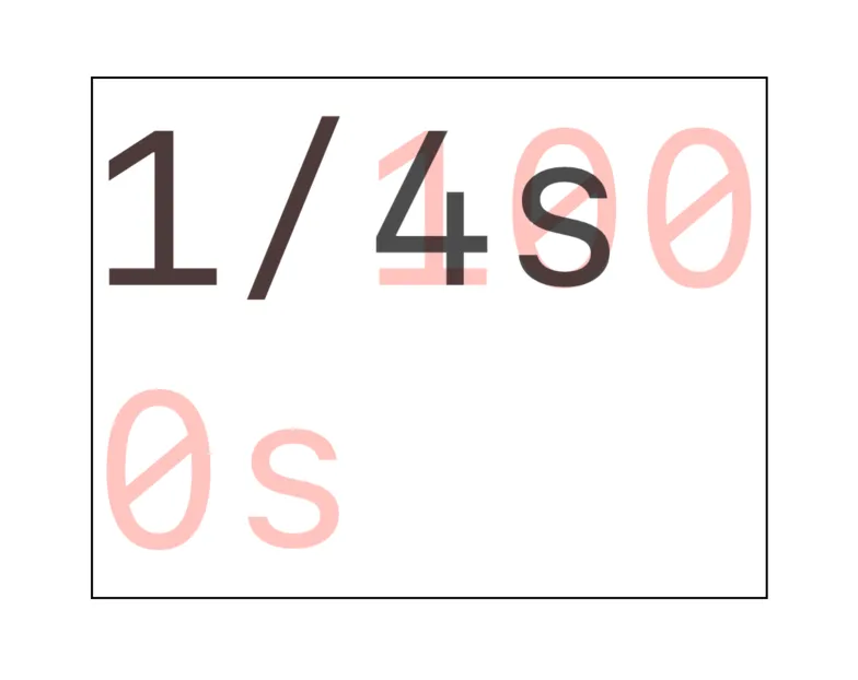
Unfortunately, at larger Dynamic Type sizes, the text becomes so large that it doesn’t fit on one line:
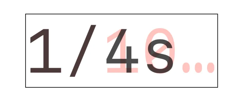
Adding .lineLimit(1) simply truncates the text:
.minimumScaleFactor(_:)
allows the text to shrink to fit in the available space. This seemed perfect
until I realized that it gets applied to each text view independently:
While this does succeed in creating a fixed-width view, the height and font size will still vary with the width of the displayed text. After several random, half-hearted attempts, I stumbled across the technique of using an overlay.
In an overlay, the contents are constrained to the size of the parent view
(unless the .fixedSize modifier is used). Thus, if minimiumScaleFactor
is applied to the hidden text, it will shrink both it and the overlay:
- The hidden text is width-constrained (and/or height-constrained)
- Scaling is applied to shrink the hidden text. This reduces the view size in both dimensions
- The text in the overlay is now height-constrained
- Scaling is applied to shrink the overlay text, making the heights match
As the heights match, the scaling factors of the two text views must be equal, ensuring that the font size of the text always matches that of the hidden.
Text("1/1000s")
    .hidden()
    .overlay {
        Text("1/5s")
            .frame(maxWidth: .infinity,
                   maxHeight: .infinity,
                   alignment: .leading)
    }
    .lineLimit(1)
    .minimumScaleFactor(0.4)
.accessibilityLabel("1/5")A frame modifier with alignment is used to ensure that the text does not get
centered, and finally, an accessibility label is added to ensure that VoiceOver
reads the actual, not hidden text.